If one asked millennial women to name one skincare brand that comes to mind, that would be Glossier.
Having built an empire with a strong online presence through their marketing website, their Instagram account as well as their presence on YouTube, Glossier., has constructed the idea of luxurious yet simple, natural skincare that its aim is the democratisation of the skincare industry.
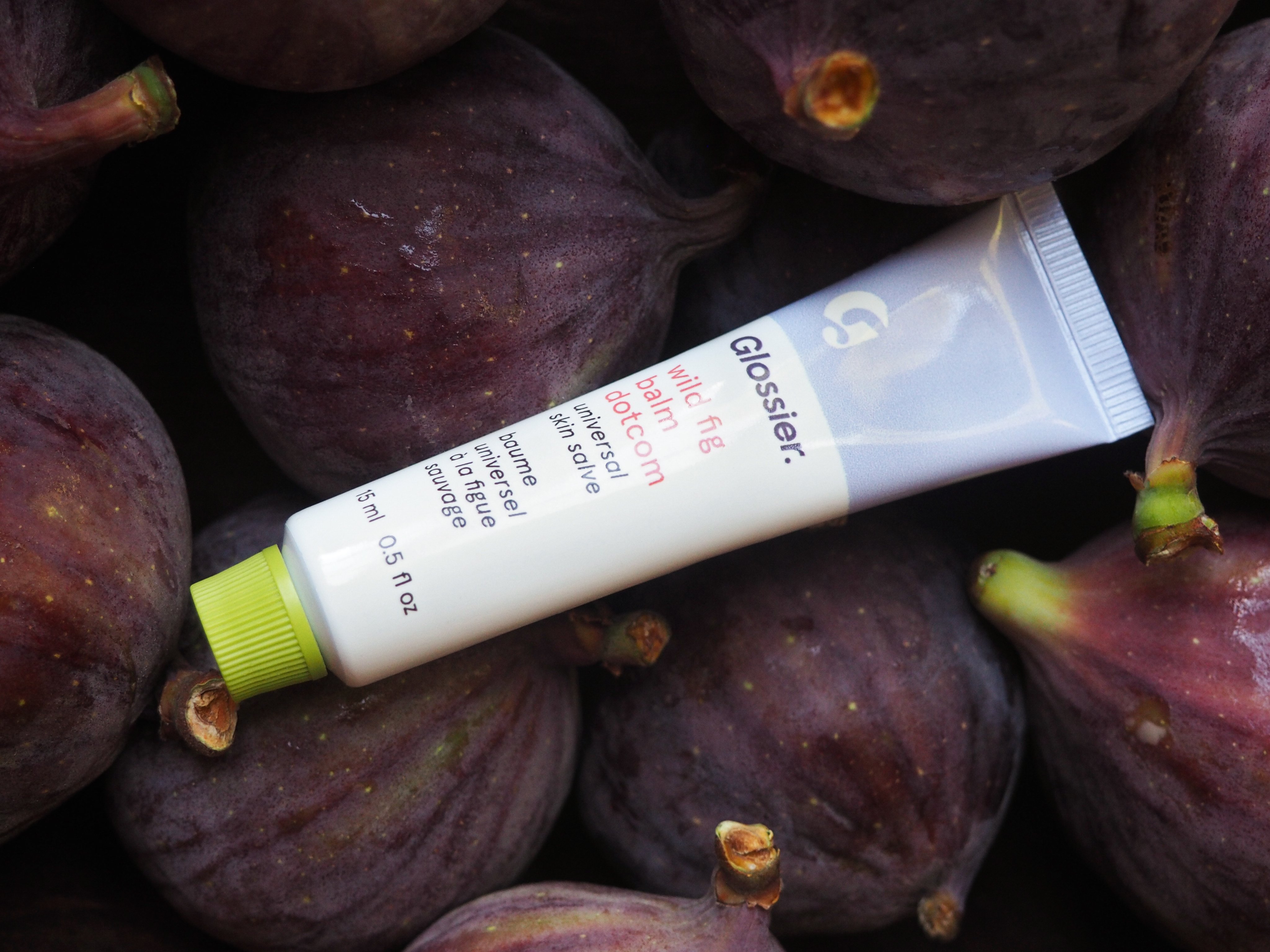
What draws one to the brand may be the highly photogenic instagramable product however the brand identity is what makes Glossier., Glossier.
Glossier. is the revolutioniser for natural glowy skin that does not hide behind the constructions of makeup and photoshop. The focus is on real life use. It exists for women who are not afraid to embrace their natural skin, show their natural colours and use products made for every day life.

But what actually makes the brand?
The tone of voice of the brand show exactly what Glossier. is about. Glossier. gives great emphasis to these particular values which have shaped Glossier. These are:
Thoughtful, Inclusive, Fun, Innovative, Friendly
The colours of Glossier. are set to:
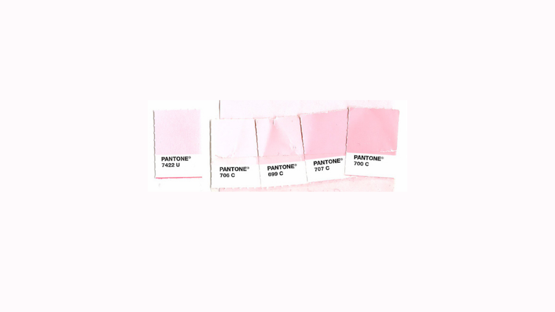
Characteristic, iconic pink colours across the colour palette highlight femininity and simplicity which are reflected in the shades of pink due to their softeness and lightness. White is also included in the brand colours which help bring together a clean minimalist and instagramable aesthetic. The wordmark sometimes changes depending on its use and placement.
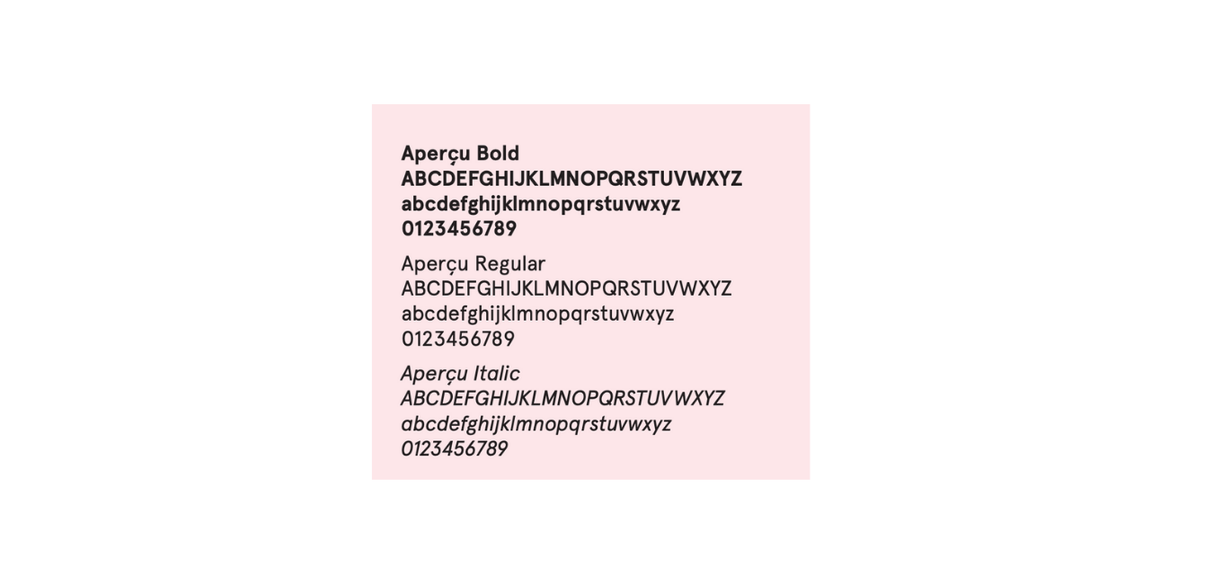
Glossier. uses Apercu as its Primary font which has unity and minimalism in its typography. Apercu Bold is used for headlines, Apercu Regular for the body text and Apercu Italics is used for the product description on packaging and on the website. Lowercase is used on the packaging. Glossier.’s logo ends in a full stop which indicates uniqueness as not many brands choose that type of textual layout to stand out.
Glossier. is true to life. Real life. Glossier. is now.
